
Serious Design Failure At USAspending.gov? 207
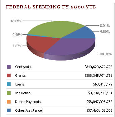
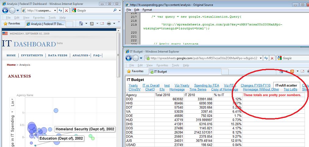
theodp writes "Over at Intelligent Enterprise, Seth Grimes declares the Federal Government's USAspending.gov website a travesty, calling it 'almost a parody of a government-transparency site.' Among the faults cited by Grimes is a botched 'Federal Spending FY 2009 YTD' pie chart that graced USAspending.gov's home page. Not only were the sizes of pie segments not in proportion to the percentage labels (due to a Google Chart API error), the colors in the pie chart didn't even match the colors and values in the table immediately below the chart. Lucky for the Feds, Grimes didn't get a chance to look behind the curtain at the Federal IT Dashboard, where they forgot to remove a (commented) reference to a Google spreadsheet that states 'These totals are pretty poor numbers' (Google workbook). Oops!"

The Important Thing is Existence (Score:4, Interesting)
In terms of government it is considerably harder to make bring these things into existence and to remove them once they're already there. Changing it after it already exists is trivial. And that's what's important and significant about this: it exists. The general population has facilitated access to something that was obscure and hidden behind a wall of government before. This may not seem like much but I think the successful creation of this type of transparency throughout the government, and if possible embedding it systemically into government processes, that we will see a great improvement in terms of freedom, success, and efficiency of our government.
It's similar to the way open source applications always get bugs patched faster than commercial implementations--crowdsourcing is a good way to catch errors. That will undoubtedly apply to government as well, especially when many politicians make their living relying on their practices being obscured from the public.
A step in the right direction (Score:4, Interesting)
Re:Criticize the Numbers Not the Presentation (Score:5, Interesting)
We should be happy that they even were aware that their numbers were poor. That means that someone is, at the least, paying attention if not objectively analyzing the data. The fact that it is a government agency makes it that much more astounding (IE. it's not going to make a difference in their paycheck or pension most likely).
Bugzilla? (Score:3, Interesting)
Pie Charts (Score:5, Interesting)
I'm surprised the guy rips into the bug calling the Google API and even says "Here's the government's chart done right" without mentioning that piecharts are a bad way to represent comparative data like this in the first place [informatio...gement.com] 3D pie charts may look fancy, but they make it more difficult to compare the actual data (which is supposed to be the whole point of plotting it). They are even worse than 2D barcharts, at least with 2D you are only looking at data being relative to slice area, and not being rendered at an angle - look at the edge in the plot he uses [google.com], there's as much if not more purple on display as the supposedly larger green slice. What's wrong with a bar chart for visualising comparative data like this? Surely it would give the reader a much more informed quick overview of spending?
Re:Criticize the Numbers Not the Presentation (Score:4, Interesting)
Heh. I read the bit about incorrect colors and sizes of pie slices, and laughed. I can't read a color coded chart anyway. GIVE ME A BAR GRAPH DAMMIT! Better yet, just post the numbers. ;^)
Re:Bugzilla? (Score:3, Interesting)
With a grain of salt (Score:4, Interesting)
The govt. always gets highly critizied. Or even when someone is just making a simple obersvation it all of the sudden becomes a "slam".
Can you imagine if companies had to bear this sort of total public critisim. How many companies have stupid errors on there website, menus, marketing, or anything else and we don't get upset.
I just take it with a grain of salt and hope things get better. The govt. isn't going to be perfect becuase it's ran by human beings...just like everything else.