
Serious Design Failure At USAspending.gov? 207
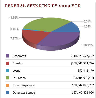
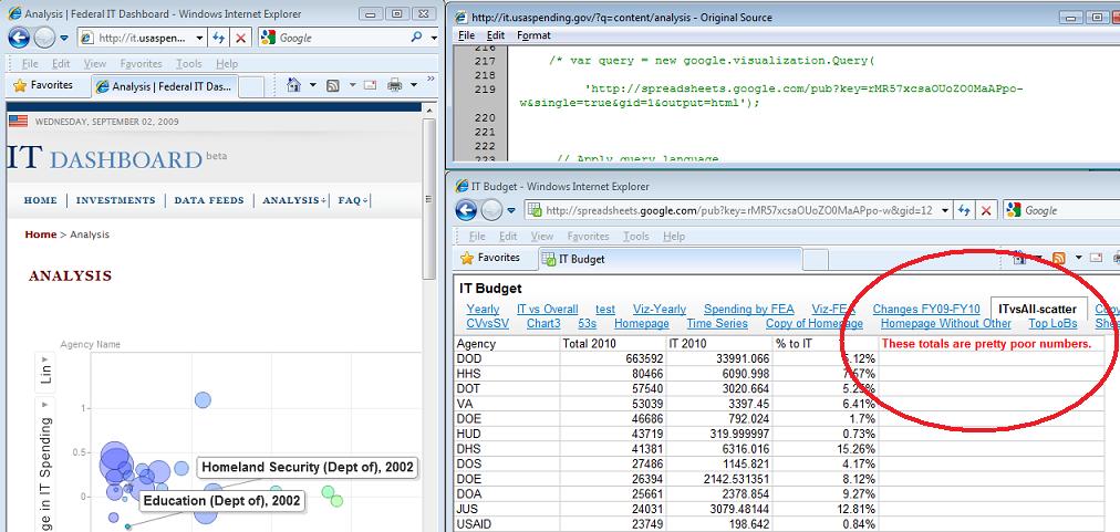
theodp writes "Over at Intelligent Enterprise, Seth Grimes declares the Federal Government's USAspending.gov website a travesty, calling it 'almost a parody of a government-transparency site.' Among the faults cited by Grimes is a botched 'Federal Spending FY 2009 YTD' pie chart that graced USAspending.gov's home page. Not only were the sizes of pie segments not in proportion to the percentage labels (due to a Google Chart API error), the colors in the pie chart didn't even match the colors and values in the table immediately below the chart. Lucky for the Feds, Grimes didn't get a chance to look behind the curtain at the Federal IT Dashboard, where they forgot to remove a (commented) reference to a Google spreadsheet that states 'These totals are pretty poor numbers' (Google workbook). Oops!"

Whatever. (Score:4, Funny)
It's good enough for Government work.
Re:Design Failure? (Score:3, Funny)
Re:A step in the right direction (Score:4, Funny)
Seems to me like the site is a work in progress and will improve with time
Then where is the digging_man.gif? Where is are the road cones with flashing beacons, or the web 2.0 equivalent, the beta status?
No. This must be assumed to be a finished website and judged "as is"
Re:Pay Attention Here... (Score:3, Funny)
So tell me, how much transparency do you get from your insurance company?